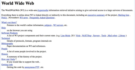
A quarter of a century ago, the internet was a year old and there weren’t any commercial websites. Here’s what the very first web page looked like, in all its primitive, minimalist glory:

Today, while nearly every business has a web presence, some haven’t progressed stylistically much beyond the above sample. Others have incorporated every latest web trend into their site, making visitors confused, annoyed, and anxious to move on to another site.
A website is a reflection of one’s business. It is the first impression many people will have of a company. Is your website attracting customers, or driving them away?
Here are a few things that will send visitors running:
Splash Pages
Popular in the last decade, splash pages are graphically flashy entryways to a website. Visitors land on a splash page, and then have to click through to the actual site. No one has time for that today. Visitors need to get to your site quickly and a splash page will slow them down, making them look elsewhere before they ever get to your home page.
Audio
If you want to immediately irritate customers and send them to your competition, blast them with unexpected audio after they arrive at your site. The same is true of video players which suddenly appear and begin playing a distracting audio track.
Intrusive Interstitials
Google penalizes sites that use these. Interstitials are those windows that pop-up after you arrive at a site. If they contain disclaimers, age verification, log-ins, or other necessary information, they’re acceptable; if they’re trying to advertise something, they’re not. If you’re trying to drive traffic to your competitors’ site, interstitials is the way to do it.
Too Much Information
Don’t overload your pages with information. Too many graphics makes a page slower to load. Too much text makes a page harder to read. Keep as much white space as possible and keep your drop-down menus simple and organized. Include an easy-to-find search box that indexes everything on your site. Visitors should have a clear path to the information they’re seeking.
Mobile Unfriendly
In 2013, mobile devices became the most popular way to access the internet. Today, Americans spend 71% of their online time on a mobile device. If your website isn’t mobile friendly, you’ll be ranked lower in Google searches, but if you want to keep mobile customers happy, mobile friendly isn’t friendly enough; your site needs to be optimized for mobile.
If you want to avoid the pitfalls of bad web design, give McFadden/Gavender a call. Our web experts will get your website working for you.


