Why do some websites invite visitors to stay and make a purchase, while others can’t maintain a visitor’s interest for more than a few seconds? As with any other sales tool, it relies on the right combination of form and content. This blog will examine the good, the bad, and the ugly of web design.
Why Do You Like What You Like?
After 25 years of being on what was once quaintly called the World Wide Web, we’ve all seen thousands of websites and we are all able to spot a good one from a bad one. Is that just personal preference, or can you define what makes a website good or bad? To paraphrase former Supreme Court Justice Potter Stewart, you know it when you see it, but why?
When you see a bad website, you’re able to clearly enunciate what you don’t like—it takes too long to load, it’s hard to navigate, there are too many popups, it contains audio or video that auto-plays, it’s packed with stock photos—but it’s much harder to define what attracts us to a good website.
If you were going to completely redo and improve your website, or even if you would like to design and build better landing pages, what elements would you look for and want to include, and what elements would you want to avoid?
Assuming that you already have a clear purpose for your website—e-commerce, business, entertainment, informational or educational—and you’ve already determined your target audience, we’ll address some important aesthetics that are crucial to getting visitors, keeping them, and generally enhancing the user experience.
Appearance
Since there’s only one opportunity to make a first impression, the appearance of a website is arguably the most important thing in that it either attracts you, inviting you to stay, or it doesn’t.
A website is a visual representation of a brand and should reflect the brand message. The visual should tell the visitor whether the brand is traditional, professional, casual, edgy, modern, or whatever the message the brand conveys.
Brand representation can be done through the use of color, fonts, and graphics, which all have a subliminal and psychological effect on visitors.
- Color – Webpage colors trend from subdued to bold, which is where they are at the moment. If your brand has a color scheme, use it to further connect the site to your brand. The caveat is to use color effectively but sparingly. White space—or negative space—is crucial because it makes the non-white space stand out, separating different sections of the page. The eye will naturally follow the white space which enhances the page structure and guides the user through the page’s content.
- Fonts – Every brand is associated with a particular font, and that font conveys an emotional, psychological message. There are fonts that send the message that a company is quirky, cool, or fun; other fonts can make a company appear respectable, reputable, or glamorous. Choose a font that sends the message you want, and then keep font usage consistent across the website, changing only when necessary for effect.
- Graphics – There’s a fine line between too many graphic images and too few. If you have a choice, go with too few. Graphics slow down the load time of a page and can distract visitors from what you may want them to see. Product photos should be high-quality and professionally shot. Otherwise, only use photos or graphics that will enhance the story you’re telling, and don’t mix graphic types. Web pages containing cheesy clip art, stock photos, illustrations, and 3D renders need to find one graphic style—which hopefully won’t be the clip art—and stick with it.
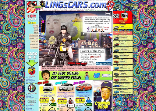
Earlier, we linked to Ling’s Cars as an example of bad website design because it looks like this:

We may have misspoken. Oddly, while the design is clearly horrifying, it’s probably more effective than most of its competitors, and was even named by Newsweek as one of the best websites on the internet. It’s colorful, gets one’s attention, and is the exact opposite of what websites in 2020 are supposed to be; consequently, visitors find it compelling and intriguing. If a website’s objective is getting people to linger, Ling’s does that quite well, even though—or perhaps because—it breaks every rule of good web design.
Responsive Design
When Google moved to mobile-first indexing in 2018, mobile first technology had already been recognized by many developers as the wave of the future. With a majority of people using phones and tablets, web pages that don’t display properly on mobile will not only be ignored by Google in searches but will be ignored by users as well. A responsive design will ensure that web pages originally meant for desktops and laptops will resize correctly for mobile devices, with type being easy to read and links large enough so that even the fattest of fingers can accurately hit them. Test your own website here.
Content
There has to be a consistency between form and content. If the graphics and fonts are quirky and nonconformist, the content has to match. Text should be short, clearly written, and broken into small paragraphs—with subheadings, if appropriate. You’ve got between six and ten seconds to snag a visitor, so copy needs to be concise and compelling and videos need to be short. Change the text frequently so visitors feel they need to return for the latest info. Finally, even the best copy is useless if no one reads it, so include all the appropriate keywords to improve SEO which means a higher SERP ranking.
Navigation
Map out your website so you can see the paths you want visitors to take. A website that’s easy to navigate not only helps visitors, but it makes it easier for Google to index your site, resulting in better SEO. Clearly label buttons or your call to action and remember the rule that every page should be within three clicks of any other page on your site. Go to websites you like and analyze their navigation. To increase simplicity and intuitiveness, consider using a card-based layout, which compartmentalizes all your information and adjusts easily for mobile users.
If designing or redesigning your company’s website seems a bit overwhelming, and you can’t spare the time or the staff to do it, contact McFadden/Gavender. Our team of web designers, graphic artists, SEO experts and content writers can provide you with a website that visitors will love and will return to again and again. At McFadden/Gavender, we know exactly how to take your brand further, and it starts with a great website.


