A good landing page can be one of the most productive ways of increasing sales for your business. Unfortunately, there’s a misconception that just about anything can be a landing page. Here are a few things that are not landing pages: homepages, “About” pages, and “Contact Us” pages.
So, what is a landing page and what makes it such a valuable tool?
What Does Your Advertising Link To?
You send out an e-blast, create a paid search ad, or post a banner on your homepage saying this:
![]()
When people click on the above link, where does it take them? To be effective, it must take them to a dedicated, post-click landing page.
A landing page is not connected to your website; it should be a standalone page whose only purpose is to persuade the visitor to take some type of action: buy something, sign up for something, download something.
Someone clicking on the call to action (CTA), “Click Here to Save!” link above, should be taken to an eye-catching page that repeats the offer—known as “message match” —which is why linking to any other type of webpage is not useful. The message on the landing page must match the original offer.
The purpose of a landing page, however, not only reinforces a message or offer, but also requires a visitor to take some type of action to receive the offer. Most times, visitors are required to provide their email address or some demographic data. Often, there’s a button that leads to yet another page that will request the data because, while it’s important to get the visitor as a customer, the goal is really to get their data so you can reach them again.
Here are three examples of effective landing pages that all have a different type of offer:
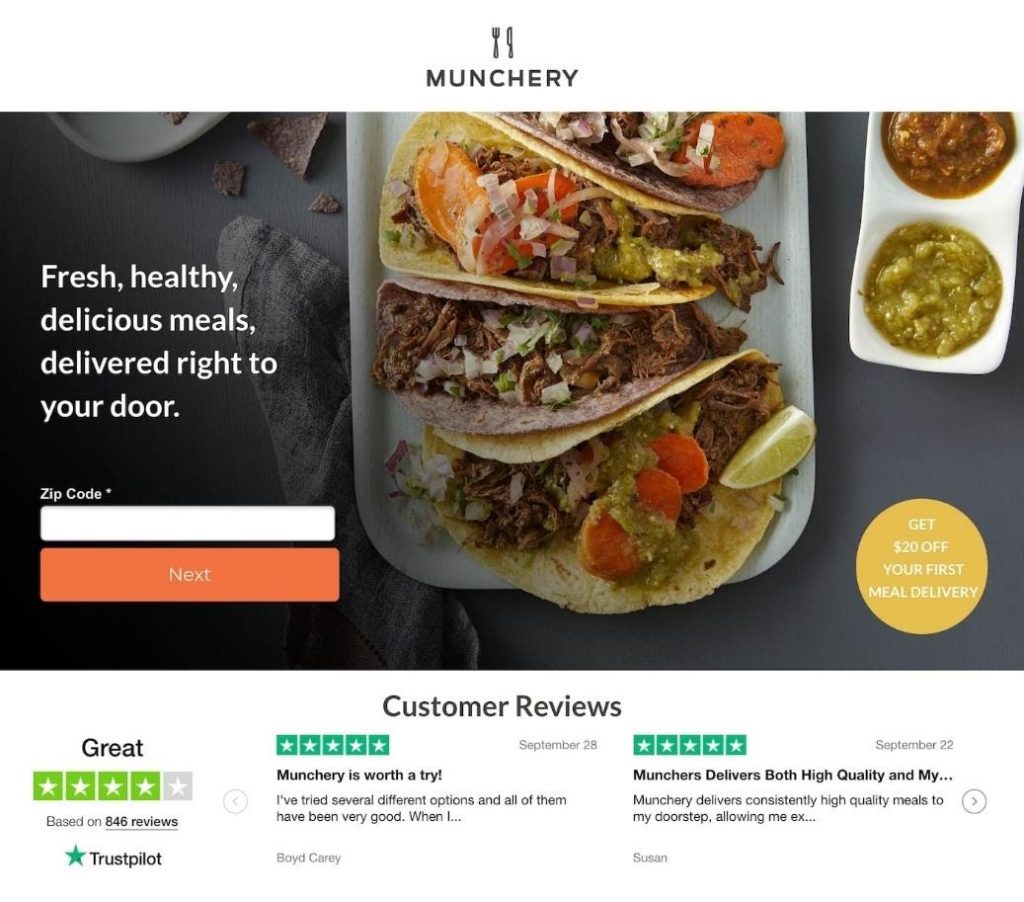
Provide your ZIP, click the “Next” call-to-action button and you’ll be taken to a page which will request delivery information such as name, address, phone, and probably email. The downside of this page is that the 20% off offer is hard to find and should be larger and at the top of the page.
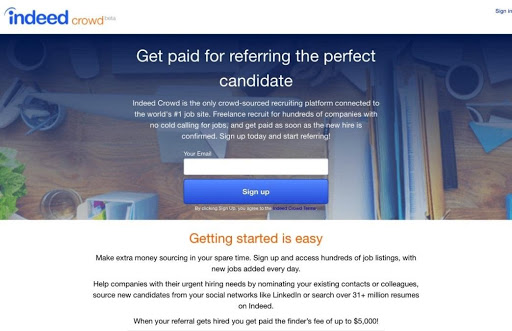
This landing page asks for an email address. Signing up will probably require the visitor to provide more data. The payoff is that if you recommend someone for a job, you could receive a finder’s fee of up to $5,000.

The video on this page gives the reasons why the course is worth the money. The “Take The Class” button is static, so it’s always available and clicking on it will most likely lead to a request for name, address, phone, email and credit card information.
The rules for creating a high-conversion landing page are few:
- The benefit to the customer should be the first thing a visitor sees. If a visitor has to search for an offer or it’s not clear why they should click a call-to-action button, they’ll leave.
- Don’t give visitors an escape route. Don’t include any external links. Your company logo should not link back to your website, and there should be no social media links. Once a visitor leaves the landing page for an external destination, they probably won’t be back.
- Brevity is your friend. A landing page shouldn’t need too much in the way of explanation. Show the benefit, make the offer, and provide a clear pathway to conversion. Too much copy and visitors will move on, especially if they view the page on mobile.
- Make sure the CTA comes after the offer. Often, companies are so anxious to get the CTA button near the top of the landing page, visitors pass it by because they don’t yet know what the offer is. There’s a logical path to conversion, and it includes putting the offer first, the call to action after.
- Test, test, test. Make the CTA in various colors, put it in different places, make it in a variety of shapes, use different graphics—determine which elements work and which don’t. You can refine the landing page through A/B testing until you have a page that will produce an above-average conversion rate every time.
- Use email marketing to link to your landing page. According to Campaign Monitor, email marketing messages have the highest conversion rate (66%) when compared to social, direct mail, and more.
Creating a great landing page with a high conversion rate is both an art and a science and it takes a lot of time to fine-tune your page until it reaches its peak performance. Plus, there’s the analytics involved in the A/B testing. It can be a great deal of work. If you don’t have the time or the staff to create a marketing campaign that includes creating effective landing pages, you’re in luck! McFadden/Gavender has all the resources you need. Our team of experts will create an email campaign with landing pages that convert.
If you need help in any area of advertising and marketing, contact McFadden/Gavender and let our designers, writers, digital and certified analytic specialists take your brand further.

